Data charging comparison graph
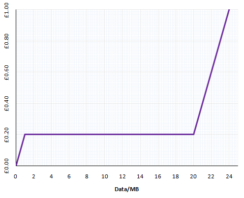
At the beginning of the month, Giffgaff finally started charging for mobile data. Because their pricing structure is quite complicated, we whipped up a handy graph to show how much it costs you to use PAYG data on Giffgaff:

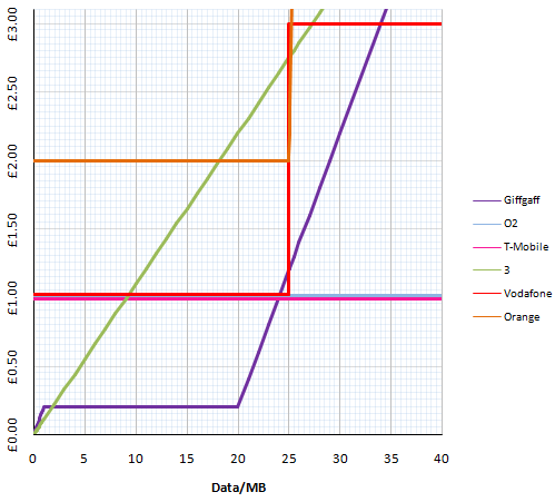
Lots of people seemed to find this graph really useful but wanted to have a bit more context. Even more useful than knowing how much Giffgaff charge for data would be a comparative diagram showing how much all the mobile networks charge. So we went back to our spreadsheets and whipped up the following:

This is a graph showing the basic PAYG rates for data on all the main UK networks. With this, you can clearly see which networks are good value and which are rip-offs. And best of all, if you know your rough monthly usage, you can estimate how much mobile data is going to cost you on any network.
We’ve kept it as the basic tariff to allow for a fair comparison – of course, many networks have special booster deals for internet usage. Also, some networks even offer unlimited data but, bear in mind that even more don’t have truly all-you-can-eat mobile data offers.
As always, please leave any comments, corrections and suggestions in the comments below.
< ?php if(function_exists('selfserv_shareaholic')) { selfserv_shareaholic(); } ?>


2 Responses to “Data charging comparison graph”