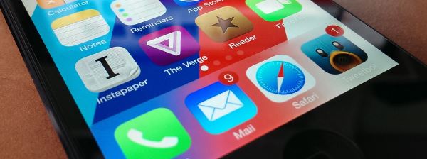
Apple is due to announce the latest version of its mobile operating system – iOS – on the 10th September. It’s hard to believe that the iPhone has already gone through 6 major revisions of its software already but, compared to its rivals, iOS 6 is already starting to look a little dated since its release less than a year ago.
What is iOS 7?
The newest version of iOS was announced back in June but hasn’t been officially launched yet. In this post we take a look at the major changes that will be introduced in iOS 7. The previous version – iOS 6 – had much of its new features overshadowed by the issues with the removal of Google Maps and the epic fail that was Apple’s Maps application. Since then Scott Forstall has been sacked as senior vice president of iOS Software and been replaced by design guru Sir Jonathan “Jony” Ive.
Are we saying goodbye to skeuomorphism?
 We’ve now seen several betas of iOS 7 and have an idea of the sort of changes that Jony Ive is introducing. First of all, some background. his predecessor, Scott Forstall and ex-CEO Steve Jobs were well known as proponents of so-called “skeuomorphic design” where the icons and graphics on the iPhone realistically resemble their real-life siblings. Any time the design resembles something we know, it’s an case of skeuomorphism. So, for example, the Contacts icon on the iPhone currently resembles a dead-tree address book complete with rind binding and tabs for each letter of the alphabet. The Notes icon is a picture of paper from lined yellow notepad. Newsstand is a wooden bookshelf with magazines displayed on it.
However, critics of skeuomorphic design point out its many flaws. It’s too challenging to make the graphics look good and it panders to an an older target audience who might be unfamiliar with the digital world. It often lends itself to inefficient interfaces and results in an awkward and inconsistent look and feel between different apps.
In contrast, Jony Ive is well known as a proponent of “flat design”. Flat design attempts to emphasise simplicity and easy-of-use but stripping everything down to its most basic, minimalist components. There’s no unnecessary detail and no clutter at all. Just simple palettes and clear, bold icons. It may seem a bit of a trendy fad at the moment, but Apple’s main rivals, Google and Microsoft have fully embraced the concepts behind flat design as these design principles and the following image should make abundantly clear:

And hello to flat design?
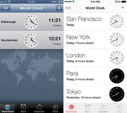
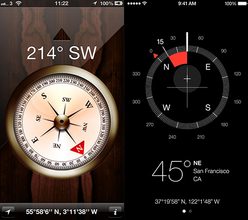
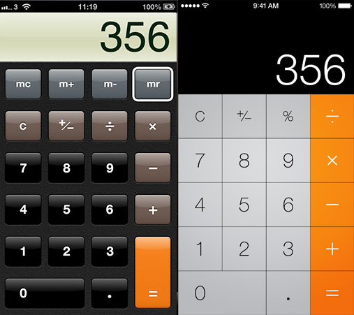
iOS 7 sees Apple wholeheartedly jumping on the “flat” bandwagon. Let’s have a look at some examples (in case it’s not obvious, iOS 6 is on the left and iOS 7 on the right):
It’s pretty unusual for Apple to take design cues from Google and Microsoft but the interface on the new iPhone will look more and more like that on Android and Windows Phone. One of the main improvements of the new visual style is how much whiter, brighter and fresher iOS 7 looks when compared to the murky dull colours used in iOS 6 and previously. There’s much more clarity and it feels more mature than the crowded complication of skeuomorphism that had to show us where to click and interact. Now there is more room for content and everything is clearly (but borderlessly) delineated by colour and clear symbols.
However, not everyone likes the new look. Critics are arguing that it’s a mistaken chasing of the idea of “flat for the sake of flat” especially as it’s a bit of a half-hearted change of ethos – there are still random gradients, rogue 3D elements and skeuomorphic relics to be found in the iOS 7 interface. Ian Storm Taylor from Segment.io has written a great article explaining how Apple’s execution of flat design is rather unrefined especially regarding the new icons.
In fact the new design has been amongst the most controversial aspects of the new software, Many find the new icons too childish and colourful and feel that it lacks the elegance that the iPhone used to represent. And the developers of the hundreds of thousands of apps currently available will be furious that they now have to change their UI and their icons to make their product feel consistent with the new visual style. Having said that, there’s not 100% consistence even within the core apps as there are still skeuomorphic wood and paper textures in the backgrounds of the iBooks and Reminders apps.
There are also problems with usability – buttons no longer look like buttons, they are just thin blue text. This is confusing for new users and not even an aesthetic improvement. Even worse, Apple assumes that everyone using the new iPhone is familiar with iOS 6 so that swipe gestures are automatic. Previously they were made clear in the UI but now it’s pretty opaque and hard to work out if you’ve not used a smartphone before. This seems to go against their simple-to-use design ethos.
But what about the visual flair?
Apart from the new design style, there are a whole lot more changes to the general user interface in iOS 7. First of all, there’s heavy use of translucence effects with overlays. This actually works really well and, in our experience, looks much better using it in real life than in screenshots. However, it’s not the most original of ideas – this “beautiful” see-through effect is more than somewhat reminiscent of the Windows Aero interface introduced for Windows Vista way back in 2005.
Part of the reason for the translucence is to provide extra depth to the 2D image on the screen. Apple have tried hard to make everything pop out a lot more in all aspects of the UI. Now the whole interface is based upon stacked layers with the background at the bottom, apps hovering above and slide out menus covering them up at the very top. There is a great use of the built-in gyroscope and some clever calculations using the parallax effect to make this depth effect more realistic. It’s most noticeable when tilting your phone when looking at icons on the homescreen but also looks great when flicking through various tabs in the Safari web browser (if you want the homescreen parallax effect on your Android handset, look out for the 3D Image Live Wallpaper app in the Play Store).
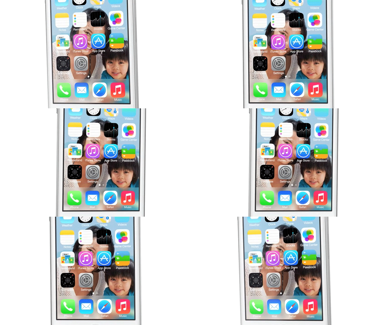
Perhaps the most subtle new visual effects are the animations but they are actually our favourite new addition. The new notifications bounce back naturally using realistic physics. The homescreen icons fall into place when you unlock your phone. The URL bar drops down out of the way to give you more screen real estate. And as you scroll through your text messages there’s also an organic and nice-looking parallax animation.
However, it’s not all good news. Apple decided to change the font to Helvetica Neue Ultra Light which is stylish but not the best of choices. Erik Spiekermann, award-winning typography supergenius was also rather disparaging about the change of typeface in iOS:
What are the new features and where do they come from?
So that’s what the interface and graphical design is going to be like. To be fair, probably the most biggest (and certainly the most noticable) additions to iOS 7 are the interface changes. However, there are also a few brand new features that Apple will be introducing so let’s have a quick overview.
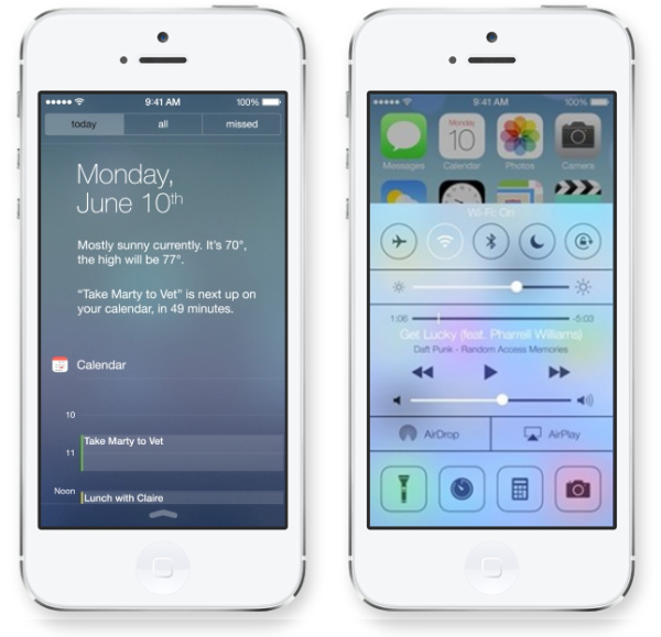
First of all, the have added a glassy Control Center which you can swipe up from the bottom of any app or screen on your iPhone. This allows you quick access to various settings such as toggling Airplane Mode, Wifi or Bluetooth. It looks great and is a really useful addition but, of course, isn’t particularly cutting edge – Android has had this option under the name of Quick Settings for ages now (since 4.1) and it’s much more advanced and customisable especially if you use third-party apps or ROMs such as CyanogenMod.
Another feature that’s already far superior in Android is the new Notification Bar. iOS 7 does add some improvements especially to the layout but Apple are still playing catchup in this area. The biggest flaw in Apple’s implementation is the fact that if your phone is unlocked when the notification comes in, there’s no persistent indicator on the screen. So if you’re not looking at your phone at the right moment, there’s icon on the status bar and no way to tell that you’ve missed anything unless you specifically check. In our usage, we’ve missed plenty of messages because of this.
Multitasking is another useful addition though also somewhat familiar if you’ve used other mobile operating systems (or jailbroken your iPhone) over the last few years. It does look good though. Apple have also added scrollable folders and a new lockscreen concept that has an animated background and allows you to swipe anywhere on the screen. Also, the ability to block contacts from the phone’s software. Again, these features have been available on other phones for ages now but you still can’t complain that they’ve made their way to iOS at last.
The weather app has had a huge makeover and looks much much better than before with cute animations reflecting the local meteorological conditions. Again, it borrows a lot from the HTC Sense UI and Yahoo! Weather but is still a great app in its own right.
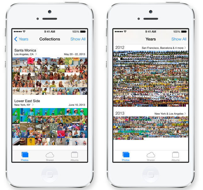
The Photo app has also been changed up quite a lot and we like what we see. Apple have added a feature that automatically categorises all the photos you take by location and date so organisation is mostly taken care for you. It’s especially handy if you’re too lazy to do this yourself. It’s now also easier to switch to video mode and to add effects to your shots.
The other main selling points of iOS 7 are much more pleasant voices for the Siri personal assisstant and Air Drop – a great new feaure that allows you to share content wirelessly with other iPhone users via Wifi and Bluetooth. There’s still no NFC capability announced for the new iPhones which is a bit of a shame though.
What else is missing apart from NFC? Perhaps the biggest disappointment is the failure to introduce widgets which have been a major selling point for Android for years and years now. It just makes having an iPhone that much slower and less useful than a smartphone running different software. There’s not really much excuse for this and it makes using iOS 7 as your daily driver pretty frustrating as you have to keep opening up app to check on things. And sharing between apps is still light years behind Apple’s competitors. Apple still pretty much prevents you moving your data between apps unless they are Twitter, Facebook or Mail. Compared to other mobile operating systems, this is again making life unnecessarily frustrating and slow.
What do you think of our iOS 7 overview? Check out Apple’s website for a more thorough run-down of the changes and some great videos demonstrating how the new software works. But in the mean time, we want to hear your opinions. Do you approve of the move to flat design spearheaded by Ives? What do you think of the look of the new icons? Which is your favourite new feature? And what do you think is still missing from iOS 7? Leave your comments below!




 Why the sudden change and why a KitKat in particular then? Apparently Hiroshi Lockheimer, the VP of Engineering at Android is a bit of a KitKat addict. And it was Google who contacted Nestlé to strike the secretive deal.


Recent Comments